For daily trackers
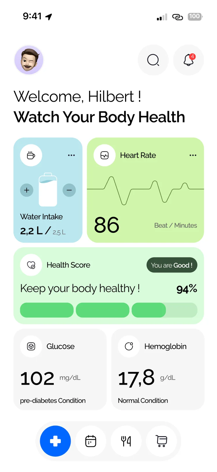
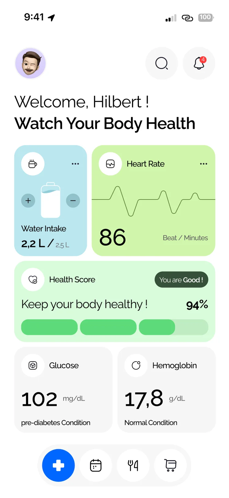
Water, heart rate, glucose and a single health score on one home screen.
01. The challenge
People track health, book care, watch what they eat, and refill meds in separate apps. Hilbert connects those jobs without feeling clinical or cluttered.
Water, heart rate, glucose and a single health score on one home screen.
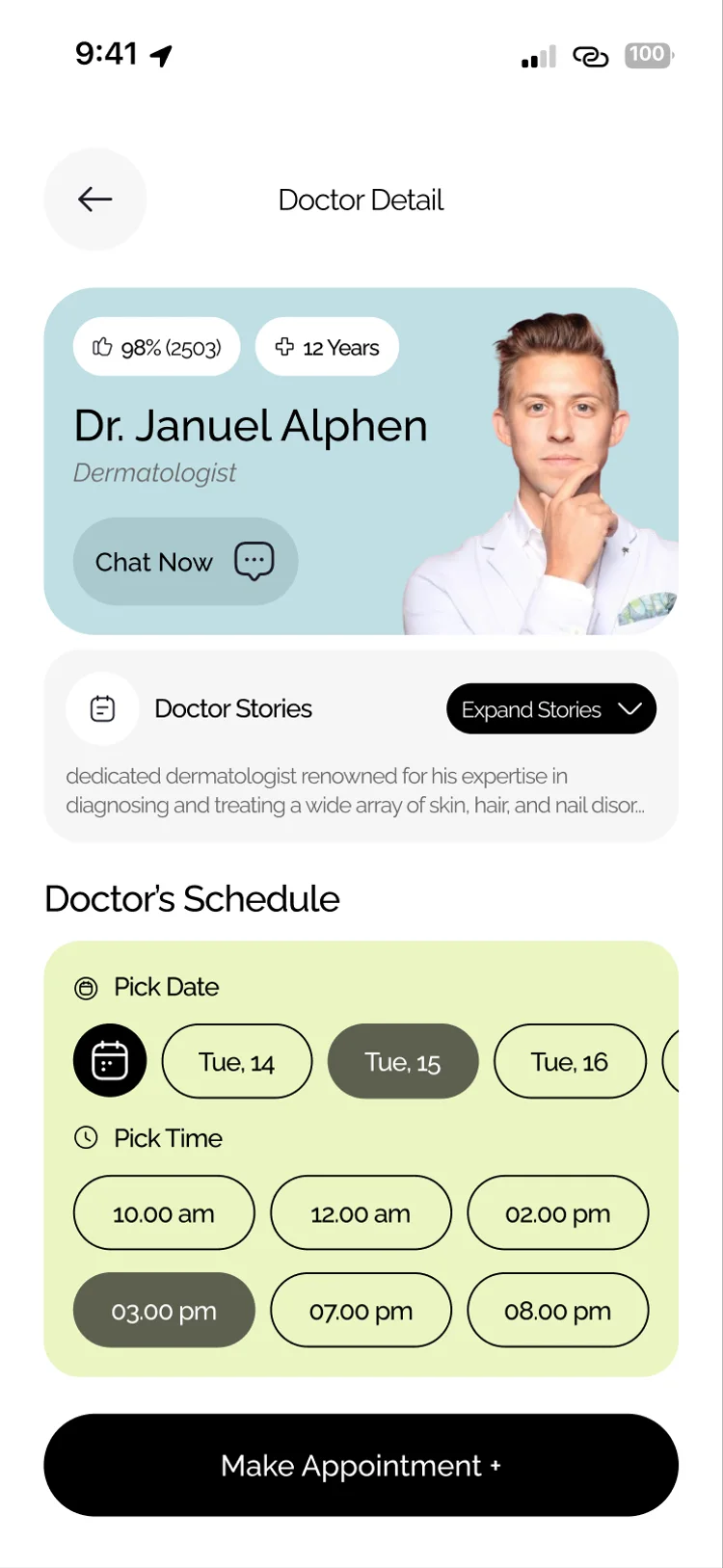
Find a doctor, book a time, and chat without leaving the app.
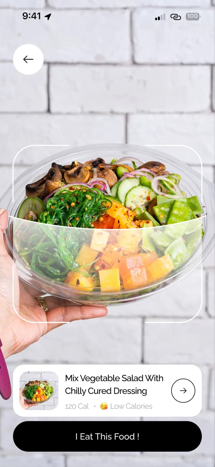
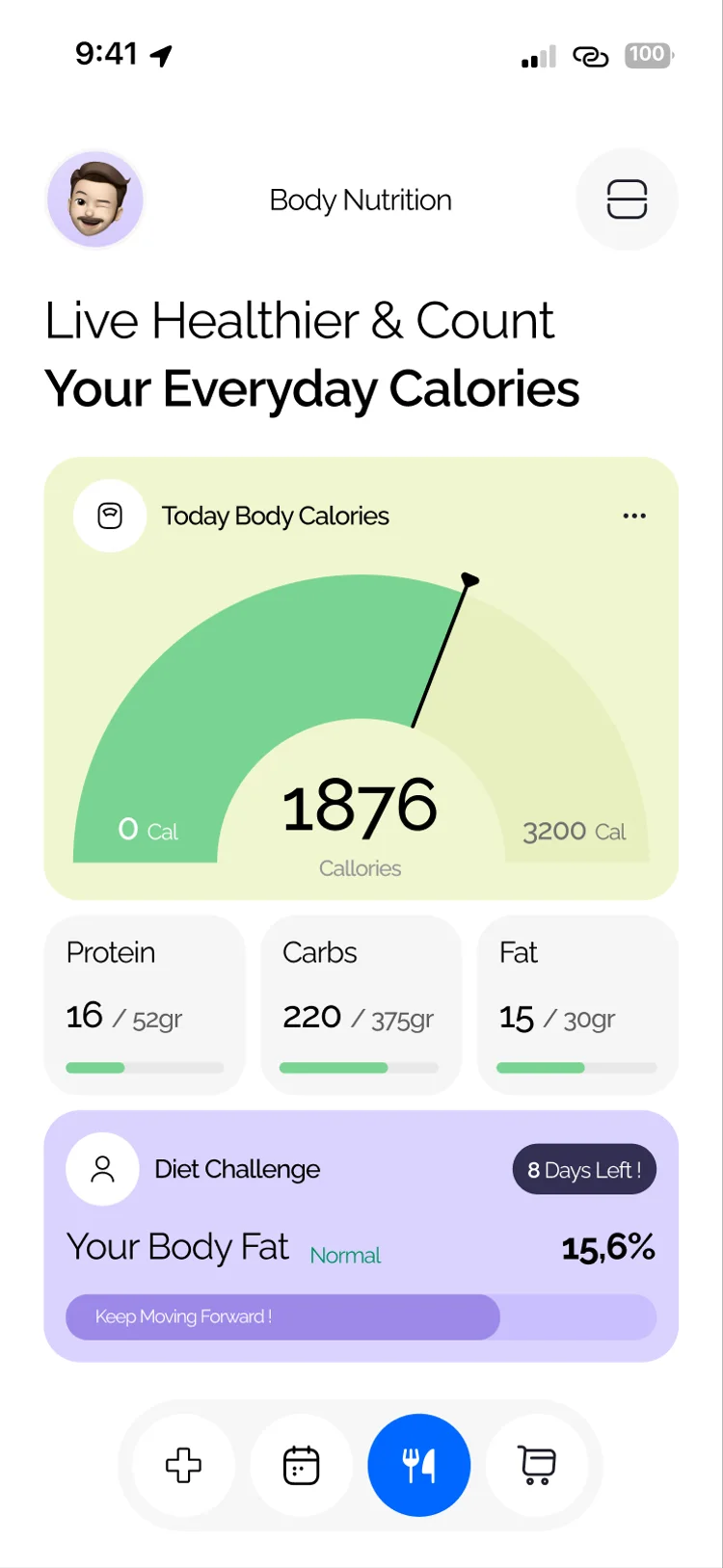
Scan food, follow challenges, and order from the apotek in the same product.
Our approach
We centred the product on a calm home for body metrics, then linked appointments, nutrition and pharmacy so each pillar feels part of one journey.
Body metrics and a clear health score on home.
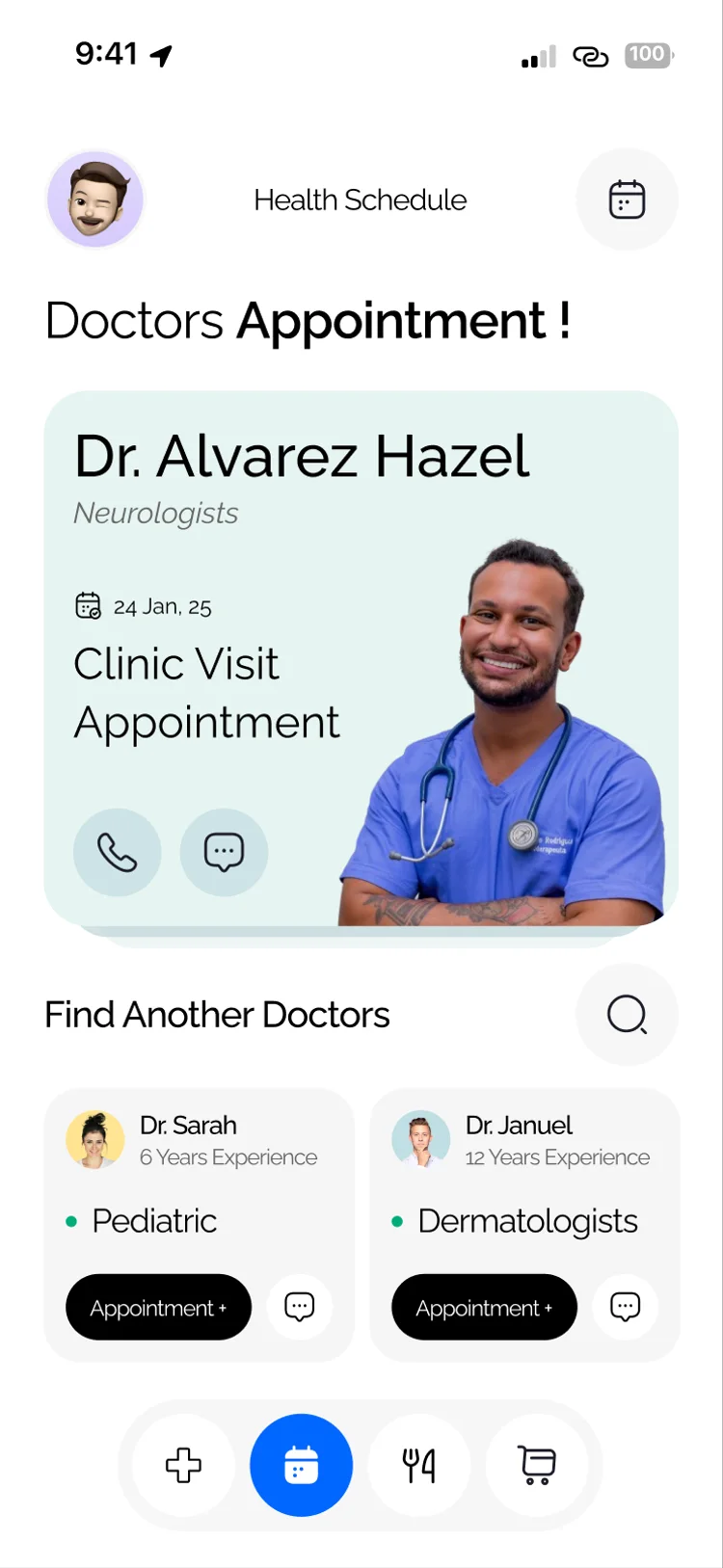
Appointments, doctor profiles and filters.
Diet challenges, food scan and nutrition detail.
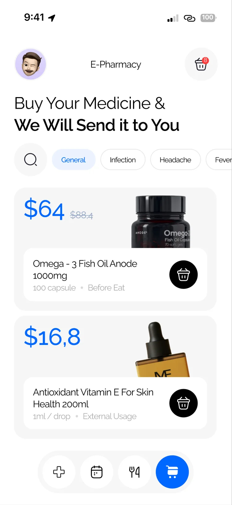
E-pharmacy browse, categories and cart.
03. How we solved it
Every screen answers a real friction in personal health apps. Here is what we designed and what users and Hilbert gain from it.
Problem
Water, heart rate, glucose and overall wellness lived in different places.
Solution
A single home with water intake, beats per minute, blood glucose and an 82% health score, plus a clear path to book an appointment.
Gain
A daily check-in that takes seconds instead of hopping between trackers.
Problem
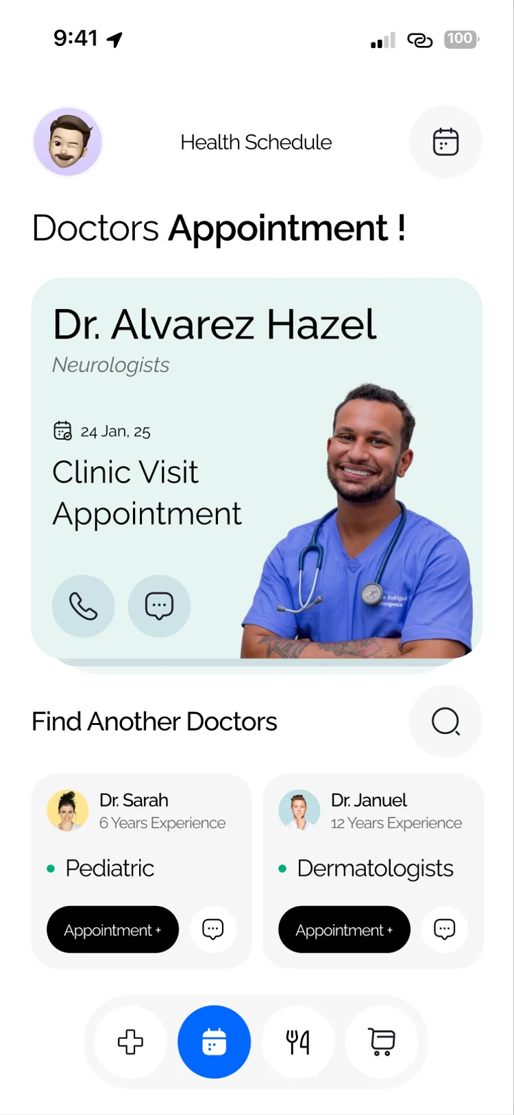
Finding the right specialist meant scrolling long, unfiltered lists.
Solution
Search, specialty filters, ratings and doctor cards with experience so people can compare and book with confidence.
Gain
Patients reach the right care faster, with less guesswork.
Problem
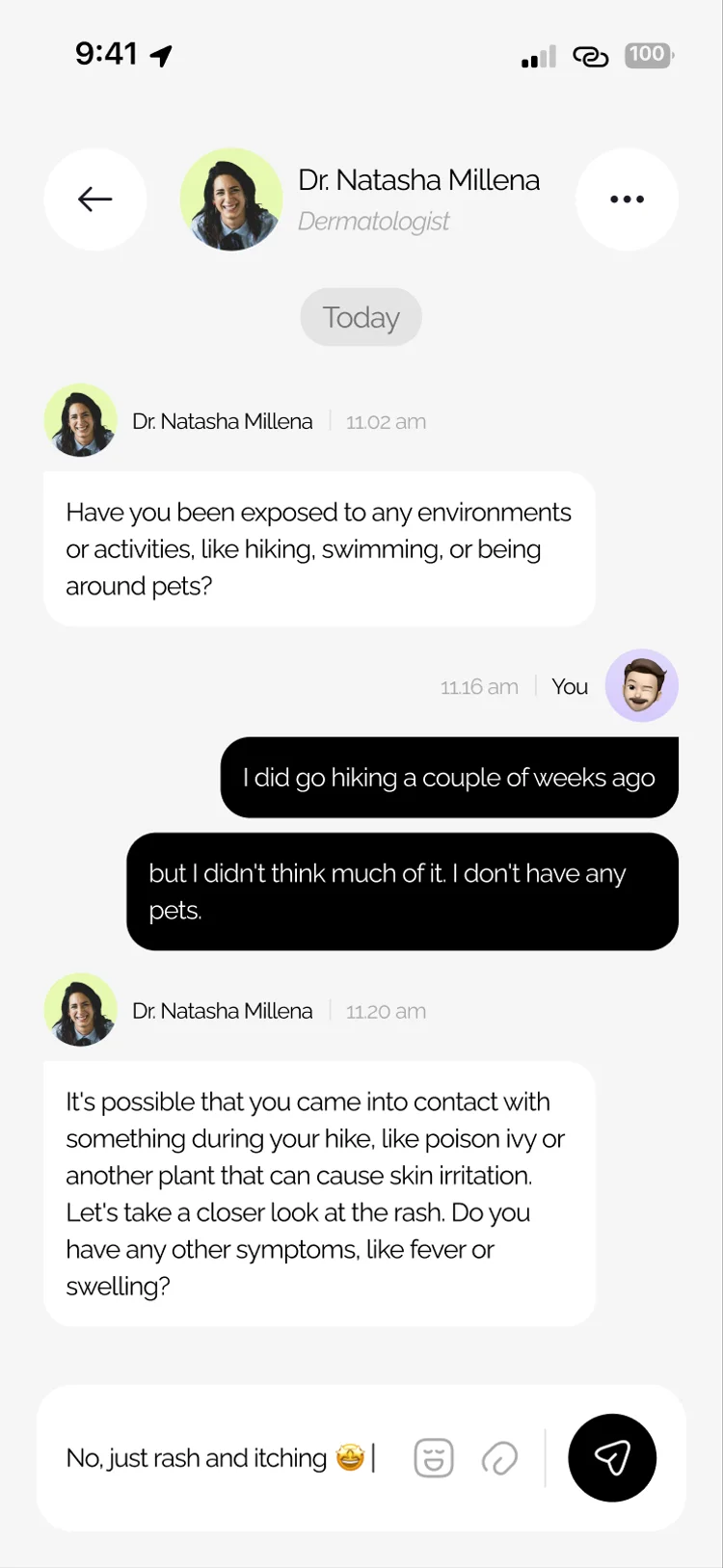
Follow-up questions often dropped out to WhatsApp or phone calls.
Solution
An in-app doctor chat with message history, so the consult stays inside the same care journey.
Gain
Context stays with Hilbert instead of disappearing into other apps.
Problem
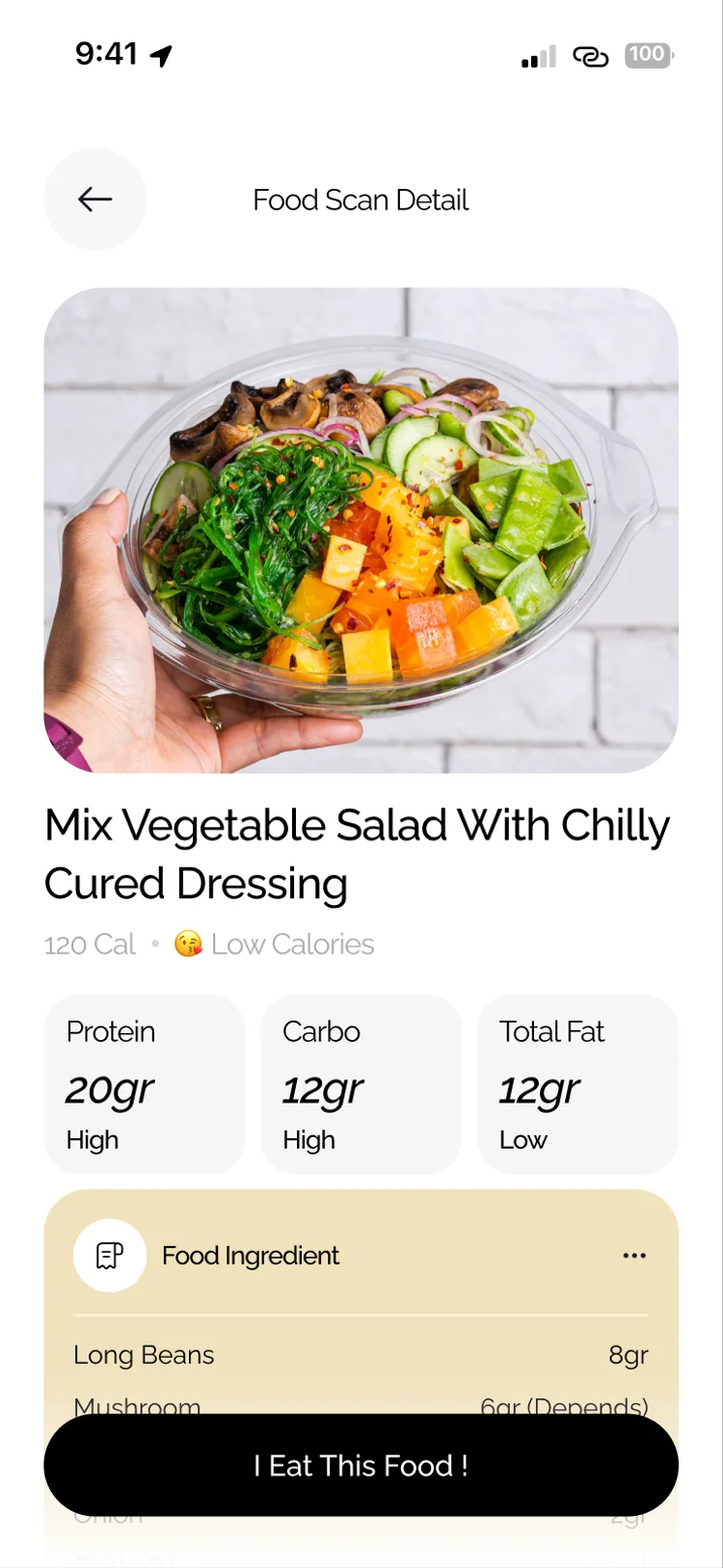
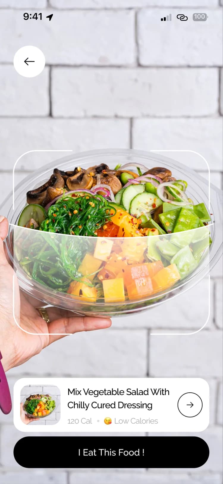
Food labels are hard to judge in the moment.
Solution
A camera scanner plus a detail view for calories, macros and ingredients, alongside diet challenges on the food home.
Gain
Decisions at the shelf become clearer without a separate nutrition app.
Problem
Pharmacy shopping often feels bolted on after the health tools.
Solution
Categories, product cards and a cart in the same bottom navigation as track, book and food.
Gain
Refills and wellness products stay inside the daily health habit.
04. The overall gain
The design turned four separate health jobs into one product people can open every day.
| Job | Before | After with Hilbert Health |
|---|---|---|
| Opening the app | Unclear where to start across multiple health tools | A welcoming home with vitals and a next action |
| Reading vitals | Metrics scattered across widgets and trackers | Water, heart rate, glucose and score in one view |
| Finding a doctor | Long lists with little way to compare | Search, filters, ratings and clear profiles |
| Asking a question | Consults leave the product for chat apps | In-app doctor chat with retained history |
| Choosing food | Guesswork from packaging alone | Scan to nutrition detail and diet challenges |
| Buying supplies | A separate pharmacy experience | Apotek browse and cart in the same nav |
Faster check-ins: daily vitals visible without hunting through menus.
Less app-hopping: care, food and pharmacy stay in one journey.
Clearer choices: scans and filters turn uncertainty into action.
A four-pillar information architecture ready for a full product build.
Screen patterns that stay consistent from splash through pharmacy.
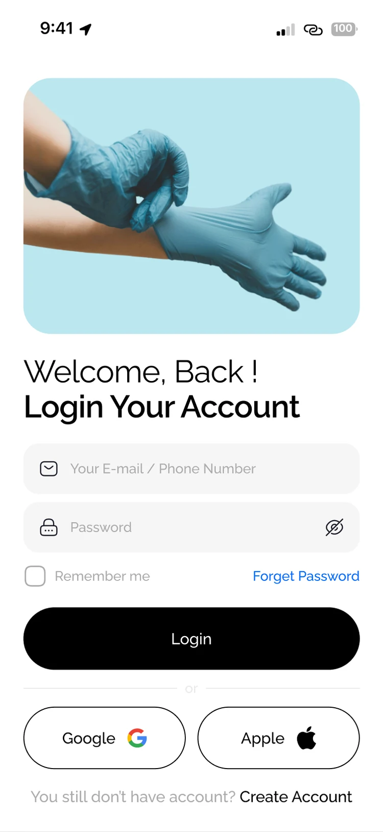
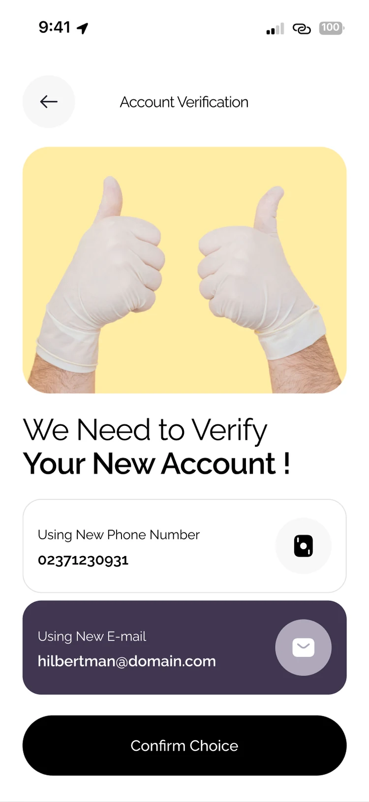
A complete mobile hand-off: auth, home, care, nutrition and apotek.
Design in detail
From food detail to doctor chat, shared headers, cards and navigation keep Hilbert calm and familiar while each module does a distinct job.

06. The outcome
Hilbert Health is a complete mobile product concept spanning daily tracking, care access, nutrition and pharmacy, ready for engineering and launch.
A calm health app designed around everyday care jobs.
One product story across four care pillars.
Work with us